Emblem centuries
Symbolorum et emblematum centuriae tres … accessit nouiter centuria (Three centuries of symbols and emblems … to which is added a new century), by Joachim Camerarius. Printed in Leipzig by the house of Voegel, 1605.
Lower Library, H.17.9
The emblem book was a popular genre in the sixteenth and seventeenth centuries, and even later: John Manning in his study The Emblem (2002) estimates that over 2,000 titles ('in who knows how many editions') have been published. In the book that founded the genre, the Emblemata written for recreation by the lawyer Andrea Alciati and published without his authority in 1531, each 'emblem' consisted of a motto, an allegorical illustration – these illustrations apparently introduced by the pirate printer – and a verse epigram. This three-part structure was often used afterwards, but by no means defines the emblem: 'The emblem's own emblem is Proteus,' suggests Alastair Fowler, referring to the shape-changing Greek water god ('The Emblem as a Literary Genre', Deviceful Settings, 1999).
Despite its popularity, there are few examples of the genre in Gonville and Caius College Library: of around forty major emblem books listed by Manning, only one (by János Zsámboki, or Sambucus) is found here. Another fine example, however, is this volume, which collects the four 'centuries' of one hundred emblems taken from nature that the Nuremberg physician and botanist Joachim Camerarius the Younger (1534–1598) published from 1590. Successive centuries treated plants, quadrupeds, birds and flying insects, and (in a century completed by the author's son Ludwig) aquatic animals and reptiles.
Camerarius gave his emblems a four-part structure: facing a motto, illustration, and verse epigram on each right-hand page, was a prose commentary on the left which tied the symbolism closely to the literature of natural history. Karl Enenkel stresses that in these emblems, 'the prose text is the main text' (see his contribution to Emblems and the Natural World, 2017). Camerarius left the composition of the epigrams to others close to him – a nephew, a friend, his son – as he made clear in his forewords.
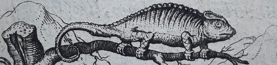
The illustrations by the Nuremberg artist Johann Siebmacher (1561–1611), although often naturalistic, yet have something of the concentration and strangeness of dreams. They are copper engravings, innovatively designed with circular frames so that they resemble medals. The Caian Frederick J. Stopp notes that following the publication of Camerarius's work, the circular frame 'became the dominant form [for emblem illustrations] in the seventeenth century' (The Emblems of the Altdorf Academy, 1974). Medals were actually struck after his emblems: those issued over seven years as prizes to pupils by the nearby Altdorf Academy (see Stopp), and others issued over at least four years to honour Heinrich Julius, Duke of Brunswick (see Peter M. Daly, Literature in the Light of the Emblem, 1979).
This transfer from printed paper to struck metal suggests a deeper aptness in the new design. Discussing the classical provenance of the word adopted by Alciati, Manning notes that in Cicero an emblema was a detachable ornament which could be transferred between objects (for Manning, this corresponds to the allegorical emblem's detachment of a phrase or image from familiar contexts, so that 'meaning is generated by dislocation'). Camerarius and Siebmacher detached the emblem illustration from the architecture of the page, and made it appear as a small, tactile token in itself. Before if ever it was a medal, it could already be carried in the mind.

. 'Incense remains scentless, unless warmed by sun or fire: that it should smell sweetly, kindle your heart in pious prayer.'")
. 'If we can tame a lion with a thrown cloak, why at last is it that we refuse to tame our own anger?'")
. 'The affect one checks with mental reins is said to be a tame horse; that which roves, a wild one.'")
. 'The ugly flatterer turns himself into anything, but the mind always remains truthful and like to itself.' The abilities of the chameleon were known even to antiquity.")
. 'O rare and fitting ornament of the mind's wisdom, to know how to be silent and to know the time to speak.' The thrush was proverbially silent.")
. 'There is a pleasant love, which harms another lover; what profits one, can harm another.' This starling is feeding on hemlock, poisonous to humans.")
. 'Human things so run into each other, that the end of one thing is the start of a second.'")